Start Asking Your Data 'Why?' - The Importance Of The Story Behind The Data (Part 2/4)

This is the second of a four part series aimed at decision makers, technical or managerial, who would like to improve their skills by adding causal intuition to their tool box.
In the first post we discussed why causality is important in today’s data driven society and what to expect from this series of posts.
Here we demonstrate that causality requires an understanding of the narrative behind the data.
The Importance of the Story Behind the Data
Causality is derived from understanding the essence of the data.
As a researcher, I consider data access as a first great step. Before drawing conclusions, however, I diligently conduct an exploratory phase where I ensure to understand the essence of the data, as much as possible. What is the context? How was it collected? Are there any known biases to be accounted for?
To better illustrate these points, let’s examine three systems and their data from different areas:
- Lifeguard duty scheduling
- Home security devices
- Health
Throughout these examples I’ll illustrate where such diligence, as in understanding the story behind the data, is beneficial.
Those familiar with his writings and learnings will identify that we borrow some memorable examples illustrated by Jueda Pearl, who is considered the Godfather of Causal Inference. The topic of this post is framed around a paraphrasing of his quote:
Avoiding Spurious Correlations by Understanding Common Causes
Imagine that you work in a council of a city with a beach and want to reduce drowning rates by improving the scheduling for lifeguards. How would you budget for their schedules? What seems like a quite obvious question for human beings is not for a machine.
If you feed a standard associative algorithm (e.g. linear regression, neural network or a graph model) drowning rate data, and other variables in the city, if available, it would highlight a strong correlation with the sales of ice cream. In Figure 1 we visualise such a correlation using made up, but plausible, data, where each point is the value of drowning rates and ice cream sales for a given week.
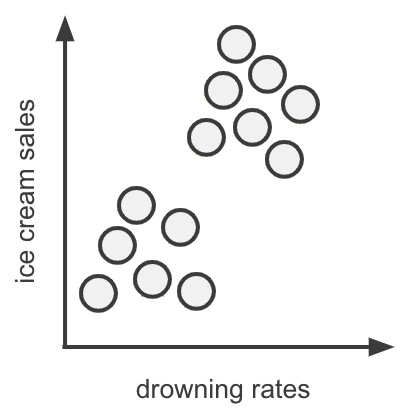
In this graph we clearly identify the correlation picked up by the algorithm. But does one truly cause the other? Surely common intuition tells us that these two are independent, i.e, there is no meaningful cause and effect. If, e.g, something happens to an ice cream delivery which reduces the ice cream sales to zero, we don’t expect that to substantially impact drowning rates. This understanding of “how the world works” suggests that this apparent correlation, interesting as it is, is spurious.
What is it that us humans know that the machines do not? We have the story behind the data. That is to say, we understand the context behind these two parameters - drowning rates and ice cream sales do not depend on each other directly, but rather have a common cause factor - the weather.
We can draw the relationships in the form of a graph as in Figure 2, where the arrow indicates the direction of causality (the weather determines both drowning rates and ice cream sales, not vice versa).
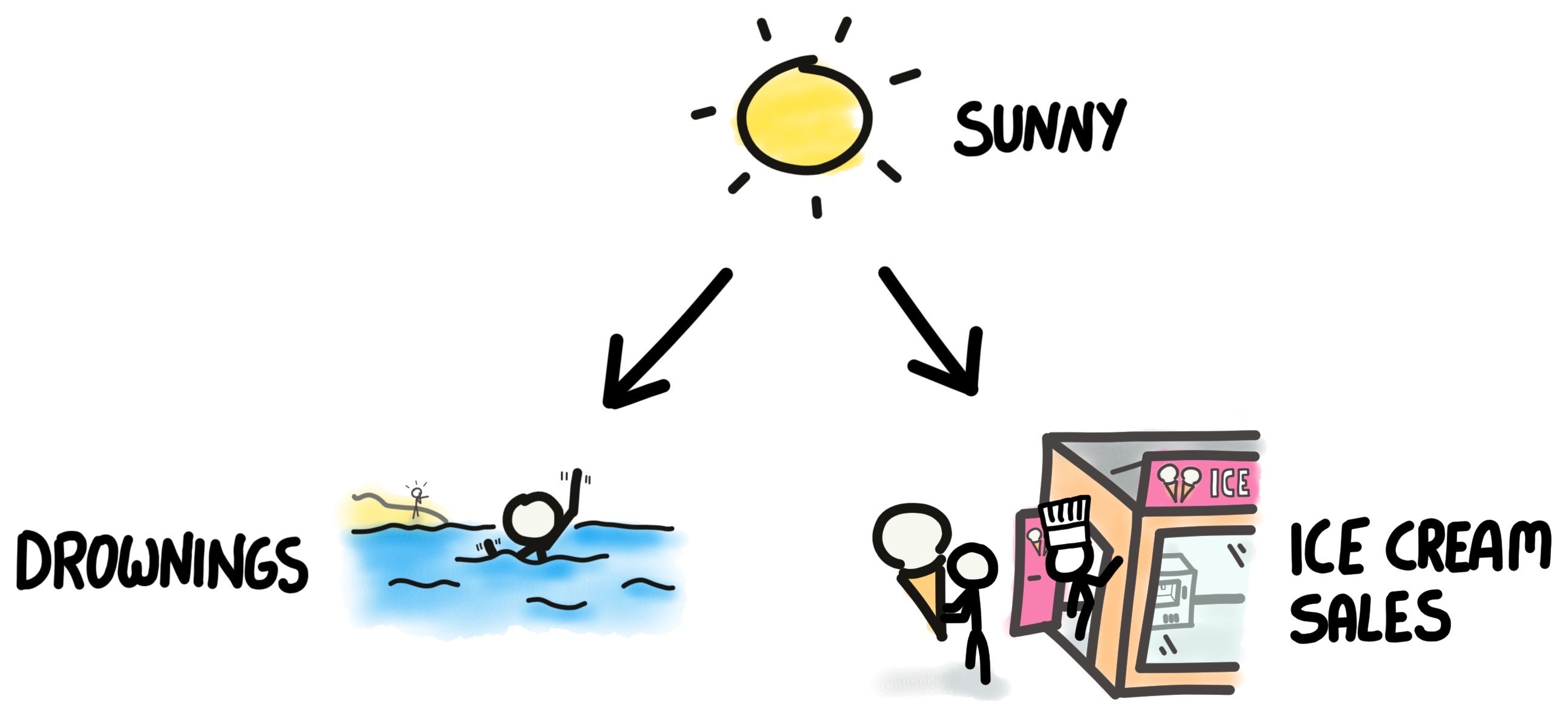
Credit: James Barker
In Figure 3 we display the same data as in Figure 1 but use symbols to represent sunny (yellow suns faces) or chilli days (blue freezing faces).
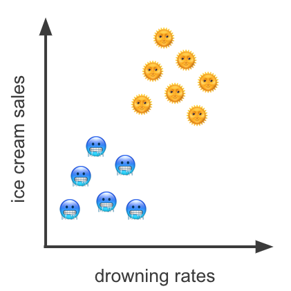
We learn that the correlation in Figure 1 was spurious.
This clearly shows that by controlling for the weather parameter, i.e by highlighting its importance, these parameters are independent. The sunny points may be considered randomly distributed as may the chilly ones.
The lesson here is that one cannot just feed ice cream sales and drowning rates to an algorithm and expect a meaningful conclusion. A domain expert, in our example anybody who knows anything about how humans act in the summer and winter, is required to incorporate domain knowledge. Or in other words, feed, in addition to the data, the story behind it.
For completeness, in Figure 4 we illustrate a more detailed graph of the relationships between the target variable to improve (drowning rates), the intervention (life guards) as well as the story between the ice cream deliveries and the sales which requires demand and supply.
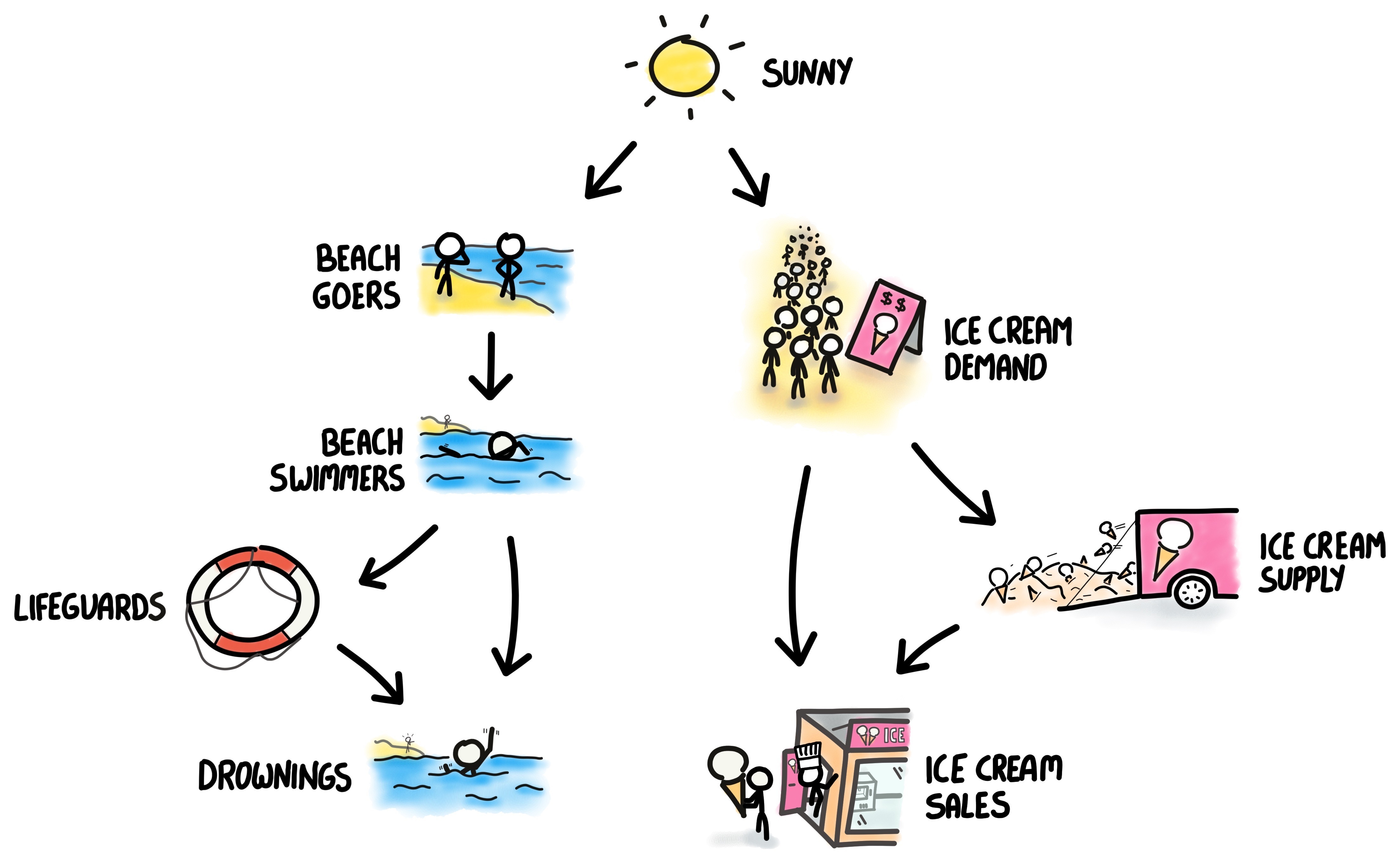
Credit: James Barker
The purpose of this figure is to show that between the three variables of interest ice cream sales, the intervention variable of life guards and the target variable of drowning rates, there might be a simple interpretation, or story, behind it. In the third post, when we formally introduce graph models, we will show how this is the missing ingredient in the mainstream statistics vocabulary to discuss causality.
Mediators As Causal Smoking Guns
Let’s turn to an engineer who is designing an improved fire alarm system. A simple approach would be to collect data solely about fire (e.g, heat, height). Such a rationale might be based on a relationship described in Figure 5.
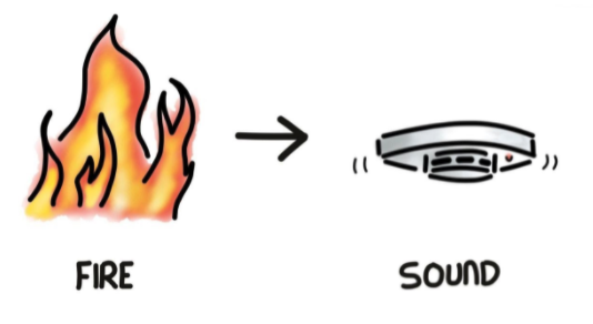
Credit: James Barker
In reality, however, this approach is naive as the alarm device is not triggered by the fire itself, but rather the smoke it produces. Hence Fire Alarm is a misnomer, and should be called a Smoke Detector. We illustrate the relationships in Figure 6.
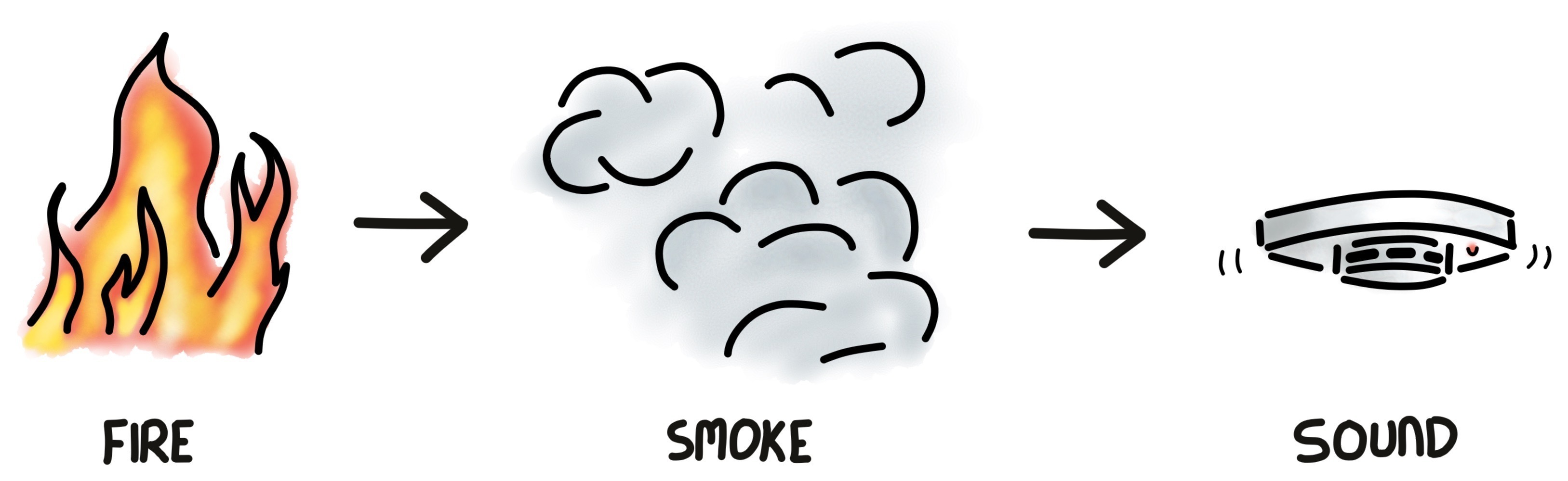
Credit: James Barker
Here we see that the smoke component is a mediator between the fire (what we are interested in learning about; or the treatment variable) and the alarm - the outcome. If, e.g, the smoke is ventilated away from the alarm it will not go off, even though the fire may be close by.
In other words, our engineer, when calibrating the gadget, should not only measure parameters of fire, but also smoke parameters (e.g, density of carbon monoxide).
This simple idea of a mediator variable can be quite powerful as we shall see in the next example, where we continue with the theme of smoke, this time that generated from burning of tobacco … and human lungs.
It is well established that smoking may increase risk of lung cancer, which was not that clear prior to the 1950’s or even 1960’s. Although scientists pointed out correlation in data between smoking of cigarettes and development of lung cancer, the tobacco industry cast doubt that it meant causation (Figure 7).
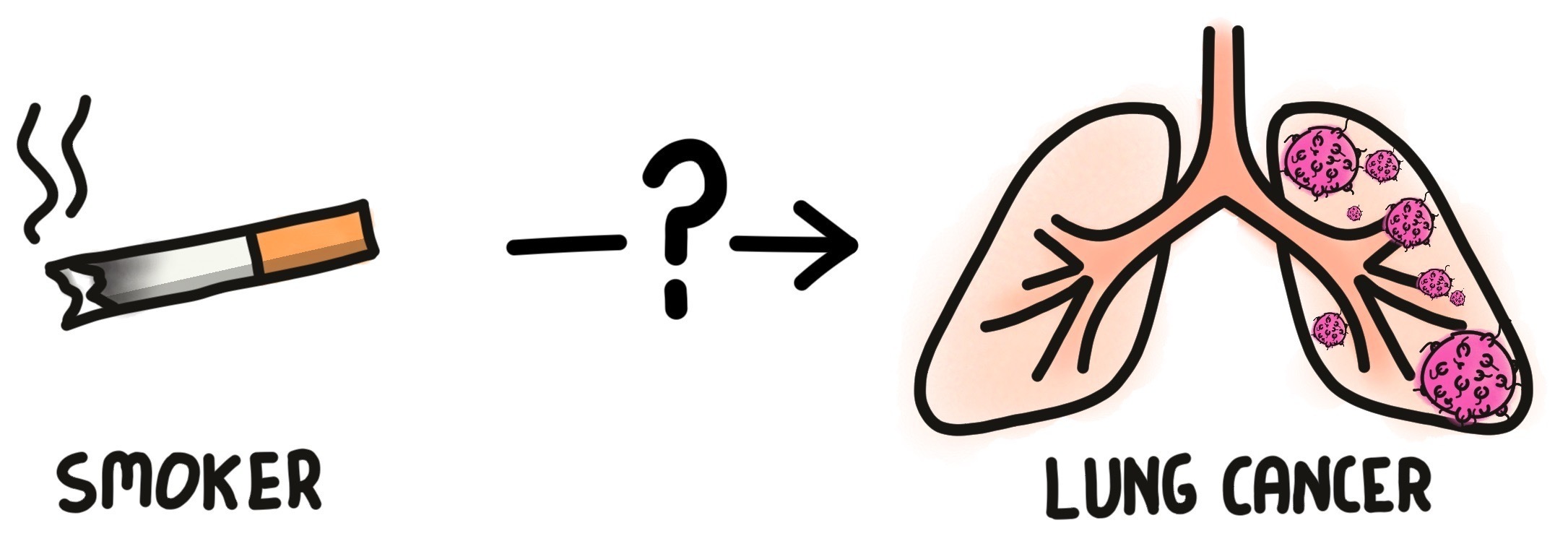
The question still remains, however:
Does smoking truly add risk to getting lung cancer?
Credit: James Barker
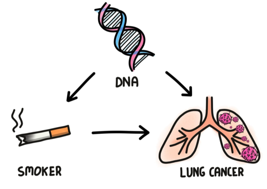
They further suggested a possible unobserved variable that might be the cause, perhaps a lung cancer gene. Their story behind the data might have looked something like Figure 8 where one’s DNA is a confounding factor that causes both tendency to smoke and increase risk of lung cancer.
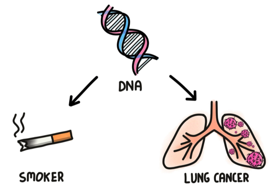
(The astute reader will notice similarity with Figure 2.)
Credit: James Barker
Taking our lesson from the drowning rates example, the tobacco industry was claiming spurious correlations.
Another possible story behind the data is in Figure 9, which is similar to before but adding a direct causality arrow from smoking to risk of lung cancer. This suggests that smoking is a direct cause to increase risk of lung cancer, but there might be a latent contribution from one’s genes. In this case one needs to control for DNA attributes1, which might be possible today under the correct experimental settings, but wasn’t in the 1960’s.
multiple causes for lung cancer. How may they be disentangled?
Credit: James Barker
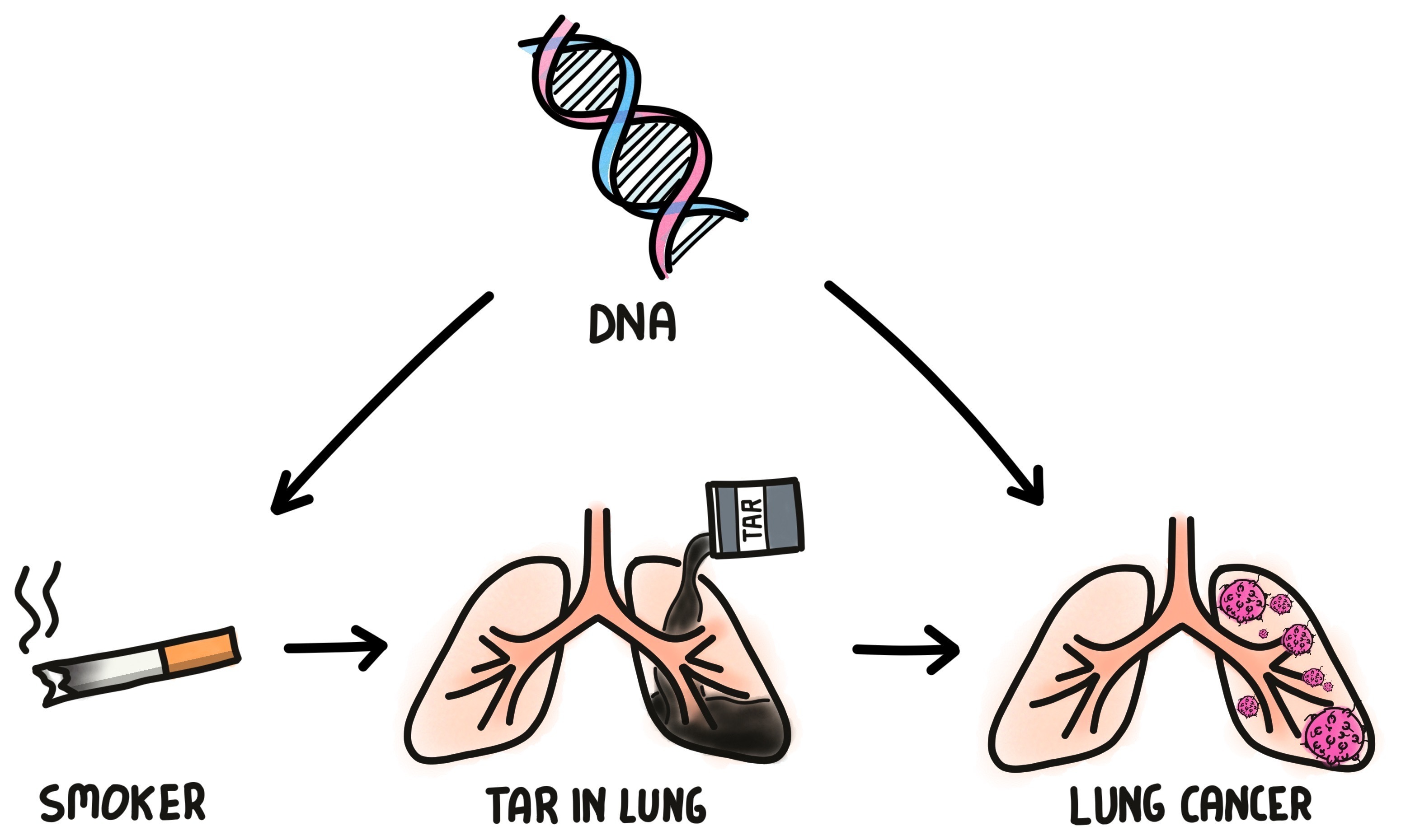
The smoking gun turned out to be from … residual tar in the lung which is a mediator between smoking and lung cancer risk, as shown in Figure 10.
Credit: James Barker
Since tar in the lung:
- is a direct byproduct from smoking and not encoded in DNA and
- is a direct cause of increase of lung cancer,
we can confidently conclude the likely risk of smoking to one’s health.
Figure 10 illustrates that even without access to DNA data, by measuring the amount of tar in lungs and associating it with smoking frequencies and lung cancer outcomes we can infer causality of smoking to disease. This sort of causal inference is possible thanks to understanding the relationships between the parameters, i.e, the story behind the data.
An Elephant In the Room Named Subjectivity

Critics correctly point out that causality in general, and the story behind the data in particular, is based on judgement calls. In the three examples demonstrated above one can probably imagine different graphs to describe the relationships between the parameters.
I learned from research and predictive modeling experience that an analyst’s job requires making subjective decisions. The challenge is to ensure that those made are sound and can adhere to the deliverable requirements. For example, when dealing with a multi-modal distribution one should not naively quote the mean value but rather understand the source of the modes.
In causal inference three points are worth considering in this regard:
- Causality from data requires understanding the story behind it.
- Constructing a narrative is subjective
- Subjective assumptions may be tested
We will address testing for assumptions in the third post when we discuss Graph Models.
Summary
To conclude this second post, we have demonstrated that data on its own is a first good step,
but on their own data is limited to association analyses.
To unveil causality one has to identify how the data might have been generated.
We saw, e.g, that ice cream sales and drowning rates depend on a common cause parameter,
the weather, not on each other.
In both smoke examples (alarm and lung cancer) we also pointed out that sometimes we need to collect additional data,
in the form of a mediating variable, to solidify conclusions about cause and effect.
Through examples like these you will realise that the common associative inferences, which are limited in capacity for decision making, may be overcome. Causal inference is not promised in all settings, but should be set as a goal.
So when designing your next analysis, it is worthwhile to paraphrase statistician William E. Denim:
Or put in another way, paraphrasing Pearl:
If you enjoyed this post, I recommend its follow up. Whereas here I demonstrated examples using figures, in the next this visualisation tool will be formally defined as a Graph Model. Pearl correctly articulated that Graph Models are the vocabulary missing from standard statistics textbooks to discuss causality. By mastering Graph Models you and your team are sure to improve data interpretation as well as design better and more cost effective experiments and ultimately obtain more value from your data.
🚧 Sorry, the Graph Model post is under construction … 👷
The Story Behind This Post
The story behind this series is detailed in the first post.
The content of this blog post and further information and resources are provided in my presentation: Start Asking Your Data ‘Why?’ - A Gentle Introduction to Causal Inference
- Slide Deck:
bit.ly/start-ask-why - EuroPython recording:
bit.ly/start-ask-why-europython - PyData Global recording


Beautiful illustrations by:
Doodle Master James Barker who is a Staff Software Engineer @ Babylon.

-
We will discuss this controlling mechanism further in detail in the fourth post when we examine Simpson’s paradox. ↩